How to Build a Custom Code Block with Nuxt MDC
components/mdc/ (as of Nuxt MDC v0.13.0). The modules referenced in this guide have also been updated to their latest versions. Further a minor styling bug was fixed. Horizontally scrolling the code block is not cutting highlighted lines anymore.Introduction
The Nuxt MDC module allows you to parse and render Markdown content retrieved from a CMS or API. It comes packed with various features, including Prose components, code highlighting via Shiki, and an extended Markdown Component syntax that permits the utilization of Vue components within MarkDown content.
In my previous guide I gave a comprehensive introduction on how to install, parse and render Markdown content with Nuxt MDC, including syntax highlighting with Prose components and the Shiki syntax highlighter. While the guide covered the basics of Prose components and syntax highlighting within code blocks, real-world projects often demand more sophisticated rendering requirements and features, such as a button to copy the code or displaying the line numbers.
In This Guide
After initiating a new Nuxt 3 project, we will enhance the <ProsePre> component from Nuxt MDC by incorporating a copy button, displaying the filename and the line numbers, as well as applying general styling for professional appearance. Alongside Shiki syntax highlighting, we will employ SCSS for highlighting selected code lines and code differences. At the end of the guide, the source code is linked, which can be used for your next project. Furthermore, the Composition API and the <script setup> syntax is used throughout this guide.
Setup
- Nuxt 3.16.2
- Vue 3.5.13
- Nuxt MDC 0.16.1
- Sass 1.79.6
- Node.js 22.13.1
- npm 10.9.2
Prerequisites
- Basic understanding of Nuxt 3
- Basic understanding of the Markdown syntax, including code blocks
- You have read and understood previous guide on Nuxt MDC as it serves as a foundation for this guide
- Basic understanding of the SCSS syntax
- node.js and npm are installed on your machine
New Nuxt 3 Project
Begin by initiating a new Nuxt 3 project and installing Nuxt MDC and Sass, as SCSS is utilized in this guide (note the module versions stated above):
npx nuxi@latest init nuxt3_mdc_code
cd nuxt3_mdc_code
npm install @nuxtjs/mdc
npm install --save-dev sass
In your nuxt.config.ts, enable the Nuxt MDC module, specify a theme, the required languages for highlighting (optional since JavaScript (js) is bundled by default), and enable the background color for code blocks as defined by the corresponding theme:
export default defineNuxtConfig({
  modules: ['@nuxtjs/mdc'],
  mdc: {
    highlight: {
      theme: 'nord',
      langs: ['js'],
      wrapperStyle: true
    }
  }
})
For further installation and configuration details regarding Nuxt MDC, please refer to my previous introductory guide.
Rendering a Markdown Code Block
As this guide focuses on custom code blocks, the Markdown to be rendered will only contain a single JavaScript code snippet and some additional meta data. Therefore, replace the code in app.vue as follows:
<script setup>
const md = `
\`\`\` javascript  [index.js] {1} additional meta data
import {parseMarkdown} from '@nuxtjs/mdc/runtime'

// Welcome to docs4.dev blog - This is a very long comment to demonstrate the scrollbar -------------------------------------------------------
async function main(mdc: string) {
  const ast = await parseMarkdown(mdc) // [!code highlight]

  console.log('Welcome docs4.dev') // [!code --]
  console.log('Welcome to docs4.dev'); // [!code ++]

  return ast
}
\`\`\`
`
</script>

<template>
  <div>
    <MDC :value="md" />
  </div>
</template>
The Markdown code block assigned to md will be rendered as <ProsePre> component. By default, the component allows adding additional information to the first line of the Markdown code block, which are passed as props. In this guide, we provide the language javascript, the filename [mdc.ts] and the line to be highlighted {1} (for more information on how to pass props to a <ProsePre> component please refer to my previous guide).
An alternative method to highlight a line is by appending // [!code highlight] at the end of the corresponding line. To highlight removed lines, // [!code --] has to be appended at the end of the respective line. Conversely, lines marked with // [!code ++] are highlighted as added code lines.
Under the hood, Shiki uses so-called transformers to add additional classes to the rendered HTML tags (Shiki documentation). Consequently, supplementary styling must be added to define the appearance of highlighted code lines.
Custom ProsePre Component
Create a custom ProsePre.global.vue component inside the components/mdc/ directory. The .global suffix is necessary for Nuxt MDC to resolve the component (documentation). The component is used to extend the <ProsePre> component from Nuxt MDC. Insert the following code to the freshly created component:
<script setup lang="ts">
const props = defineProps({
  code: {
    type: String,
    default: ''
  },
  language: {
    type: String,
    default: null
  },
  filename: {
    type: String,
    default: null
  },
  highlights: {
    type: Array as () => number[],
    default: () => []
  },
  meta: {
    type: String,
    default: null
  },
  class: {
    type: String,
    default: null
  }
})

const codeCopied = ref<boolean>(false);

const copyCode = (): void => {
  navigator.clipboard.writeText(props.code)
      .then(() => {
        codeCopied.value = true;
        setTimeout(function () {
          codeCopied.value = false;
        }, 5000);
      })
      .catch((e) => {
        console.error('Error: Unable to copy code.');
      });
}
</script>
The defineProps() part is taken from the original <ProsePre> component of Nuxt MDC. It is then assigned to the props constant for easy reference.
The copyCode function leverages the writeText() method from the Clipboard interface to copy the code to the clipboard, which in turn is sourced from props.code. If the code is copied successfully, the reactive state codeCopied is set to true for a duration of five seconds. This state variable is subsequently utilized to notify the user. In case the copying process encounters an error, such as a lack of browser support for the ClipBoard interface, an error message is logged to the browser console.
Next, add the template of the custom ProsePre.global.vue component:
<template>
<div class="pre">
<div class="pre-head">
<div v-if="props.filename" class="filename">
<i>{{ filename }}</i>
</div>
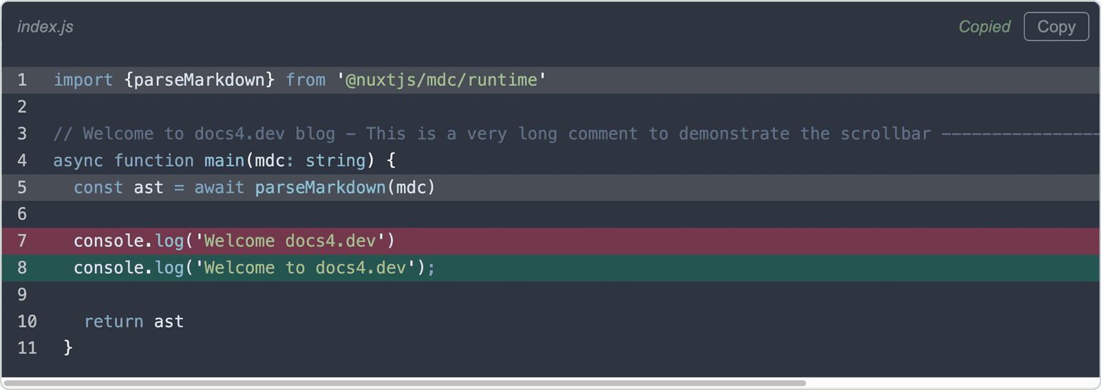
<span v-if="codeCopied" class="copy-success"><i>Copied</i></span>
<button class="copy-btn" @click="copyCode">Copy</button>
</div>
<pre class="pre-body" :class="$props.class"><slot/></pre>
</div>
</template>
Due to a design decision, the template is structured in two distinct sections: a head <div class=“pre-head“> and a body <pre class=“pre-body“ … > section, both encapsulated with a wrapper <div class=“pre“>.
The head section encompasses the filename associated with the code block (line 4-6), a copy button (line 8) and a message indicating that the code was copied successfully (line 7). v-if=“filename“ ensures, that the filename is only rendered, if it exists in props.filename. The copy button invokes the copyCode() method upon being clicked, as previously described. Upon successful code copying and when codeCopied is true, the success message is displayed for five seconds before disappearing.
The body section closely resembles the source code of the original <ProsePre> component, with the addition of the class=“pre-body“ attribute for styling purposes.
Styling and Line Numbering
Proceed to apply styling to the custom ProsePre.global.vue component:
<style lang="scss">
.pre {
  overflow-x: hidden;
  border-radius: 6px;
  margin-bottom: 3rem;
  background-color: var(--shiki-default-bg);
  border: 1px solid var(--shiki-default);

  &-head {
    display: flex;
    justify-content: flex-end;
    align-items: center;
    padding: .5rem .5rem .5rem .75rem;

    .filename,
    .copy-success,
    .copy-btn {
      font-family: Arial, "sans-serif";
      font-size: .8rem;
      color: var(--shiki-default);
      opacity: 0.5;
    }

    .filename {
      margin-left: 0;
      margin-right: auto;
    }

    .copy-success,
    .copy-btn {
      padding: 0.25em 0.75em;
      border: 1px solid transparent;
      border-radius: 4px;
    }

    .copy-success {
      color: lightgreen;
      border-color: transparent;
    }

    .copy-btn {
      background-color: inherit;
      border-color: var(--shiki-default);

      &:hover,
      &:active {
        color: lightgreen;
        border-color: lightgreen;
      }
    }
  }

  &-body {
    margin: 0;
    padding: .75rem 0 .75rem 0;
    border-bottom-left-radius: 6px;
    border-bottom-right-radius: 6px;
    overflow-x: auto;

    code {
      display: inline-block;
      width: 100%;
      min-width: max-content;
    }

    .line {
      padding: 0 .75rem;
      line-height: 1.6;

      span {
        background-color: transparent !important;
      }

      &.highlight,
      &.highlighted {
        background-color: color-mix(in srgb, var(--shiki-default-bg) 70%, #888888);
      }

      &::before {
        content: attr(line);
        padding-right: 1.25rem;
        display: inline-block;
        opacity: 0.8;
      }

      &.diff.remove {
        background-color: color-mix(in srgb, var(--shiki-default-bg) 65%, #F43F5E);
      }

      &.diff.add {
        background-color: color-mix(in srgb, var(--shiki-default-bg) 75%, #10B981);
      }
    }
  }
}

pre code .line {
  display: block;
}
</style>
The overflow-x properties in line 3 and 58 as well as the properties for the <code> element in line 60 to 64 enable code scrolling within the body of the custom <ProsePre> component when a code line exceeds the available width. Since wrapperStyle: true from nuxt.config.ts only applies the background color to the code lines themselves, we have to apply the background color to the rest of the custom <ProsePre> component manually in line 6. Here, the color is retrieved from the —shiki-default-bg variable, which comes with the Shiki highlighter.
In line 76 the background color is set for highlighted code lines, as defined in the Markdown code block.
&.highlight,
&.highlighted {
  background-color: color-mix(in srgb, var(--shiki-default-bg) 70%, #888888);
}
Code lines defined at the beginning of the code block are added with the highlight class in the final HTML, while those marked with // [!code highlight] receive a highlighted class.
The CSS function color-mix() mixes two colors (—shiki-default-bg and gray #888888) in the srgb color space, with 70% determining the portion of the first color (for more information and browser compatibility, please refer to mdn web docs). This method ensures relatively consistent color matching across both light and dark mode themes.
Code lines denoted as code differences // [!code --] and // [!code ++] are assigned diff remove and diff add classes, respectively, and are styled in line 86 to 92.
&.diff.remove {
  background-color: color-mix(in srgb, var(--shiki-default-bg) 65%, #F43F5E);
}

&.diff.add {
  background-color: color-mix(in srgb, var(--shiki-default-bg) 75%, #10B981);
}
Adding code line numbers with Nuxt MDC is straightforward. We utilize the ::before pseudo-class of each code line element with the class line (lines 79 to 84) to render the number via the content attribute (line 80). The number in turn is contained in the line attribute, which is added by Nuxt MDC to every <span class=“line“> element. The value of the HTML line attribute can then be retrieved with the attr() CSS function on the corresponding element.
&::before {
  content: attr(line);
  padding-right: 1.25rem;
  display: inline-block;
  opacity: 0.8;
}
The remaining styling is chosen based on preferences or inherited from the initial Nuxt MDC <ProsePre> component.
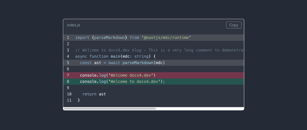
Final Custom ProsePre Code Block Component
Below is the resulting custom <ProsePre> component for code blocks:
Summary
This guide, following the introductory one on rendering Markdown with Nuxt MDC, delves deeper into building a custom <ProsePre> component to render code blocks written in Markdown. The initial <ProsePre> component is enhanced with additional features such as filename display, copy button addition, line numbering, and line highlighting, making it more practical for real-world projects. The source code is available on GitHub.